Eric Weeks - personal pages - miscellaneous/links

Advice for making good web pages

...Stylistic advice, that is. This could also be titled "Eric's Web Page Pet Peeves." Also, at the bottom of the page is a collection of useful links.
[home] [research]
[software] [pics]
[misc] [about me]

weeks/physics.emory.edu

There's already a lot of good advice out there on how to make good web pages (see some links below, for example). Unfortunately a lot of people are ignoring this sort of advice. Here's my thoughts on creating web pages, which you're free to ignore. Most of this was written in 1997-2001, and is a bit obsolete these days (this comment added in 2022). Very few people now code directly in HTML, and so it's harder to make the mistakes listed on this webpage. I'm leaving it here just in case it's of interest.


  1. Content first. The most important thing for a web page is content, some sort of information, something (hopefully) new. Links to other web pages aren't really content (unless your collection of links is truly unique for some reason). Fancy graphics are not content, unless you made them yourself, in which case they are definitely your content and worth putting on the web.

    Another way to state this is that when you start creating a home page, worry first about content, and last about font formats, cute graphics, and snazzy backgrounds. Content is far more valuable and interesting! Later you can go back and improve the visual appearance. (Which explains why some of my web pages are rather plain...)

  2. No animated GIFs. And definitely no blinking text, either. The only animated GIFs I've seen that I liked were small little movies, where it is optional for you to look at them ( like on this page). Almost all animated GIFs are content-less, and are distracting and annoying. (Comment added in 2022: This is much less of a problem these days than it was 20-25 years ago.)

  3. Don't move your web pages. If you can at all help it, that is. I really dislike it when someone decides to reorganize their web site, and I have to go through my web pages to change the links to their pages. This also messes up search engines which store your page in their database; search engines are how most people find your pages, very few people come in through your home/entrance page. Please, once you make a page, leave it where it is, unless you absolutely have to get rid of it for some reason. If you move your page, nobody can find it.

  4. Don't steal. This should go without saying, but don't take images (or anything else) from other web pages, unless they give you permission. If you have to steal something, provide credit for what you're stealing. If you have permission to use something, you should still provide credit. I realize that this sort of theft usually will go unpunished, but it's extremely rude.

  5. Frames are evil. Frames may seem clever, but I find them unhelpful when I'm surfing; also some browsers don't handle them properly (in fact, your pages aren't viewable at all with some browsers). In general, using frames for navigation can be replaced by putting a button-bar of some sort along the top or side of your pages (like the buttons at the top of this page). I just find it annoying to have to keep clicking in various little windows in order to navigate properly; it's also a pain to link to some internal portion of a web site that uses frames. If you still must use frames, allow people to choose a non-frames version of your page.

  6. Don't mess up the link colors. When you follow a link, then return to a page, the link should be a new color, indicating you visited that link already. It's very frustrating to have a page full of links, and I investigate a few of them, and then I have to remember which ones I've already looked at. Make sure to set "LINK" and "VLINK" differently when you are specifying link colors -- this sets the color for links you haven't visited, and the links you have. Most often, it is the professionally designed pages that do this. Argh!

  7. Be very careful with font sizes. Another problem with some professional looking web pages is eensey teensy little tiny fonts. Hey, maybe on your 640x480 pixel screen the writing looks huge. For those people out there using 1600x1200 pixels, your small fonts are unreadable. What really annoys me is that everybody can set their own default font size with their browser, yet some pages decide to override this. My advice: most of the text on your website should be the default size, such as the text on this web page. Then, people viewing their web page will always get to view it at whatever size is comfortable for them. I think the problem is people using a <font size="2"> command; I'm not convinced that the "font" command is a useful one.

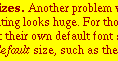
    For example, I'm using Netscape, and I can't read the writing on some pages unless I change the default font size for my browser to be huge, but then other web pages load with the typesize far too large. (My example page has changed and I can't find it so you'll just have to consult the picture at left) The image at left is a screen-shot to show you how tiny it looks in my browser. The image at right is a screen-shot taken from the page you're reading, at the font size which is the default for my browser. If the text of this sentence is larger or smaller than the image at right, be glad -- it means that you're reading this web page at whatever font size you selected.

  8. Consider avoiding long filenames. If you're reading a magazine and see two web pages listed, which would you rather look at: Often the second one can be abbreviated as http://www.foo.edu/~bob/research/bh/ because "index.html" will come up as the default page for that directory, thus making it even shorter without sacrificing any of the organization that you originally had. I realize it's useful to you to use long file names, but it's nasty for anybody who ever needs to type it in. Maybe this isn't as useful to you if you don't think your web page is going to get mentioned in a magazine, and that's a legitimate point. Then again, if I am going to link to your page, I may have to type it in to the HTML code. At the very minimum, I recommend avoiding punctuation like _ and - and . and also avoid capitalization.


Other useful places:


Current address:
Eric R. Weeks
Department of Physics
Emory University
Atlanta, GA 30322-2430